Industry
Logistics
Service
UI Design, UX Design, Prototyping, Design Systems, Accessibility
Tools

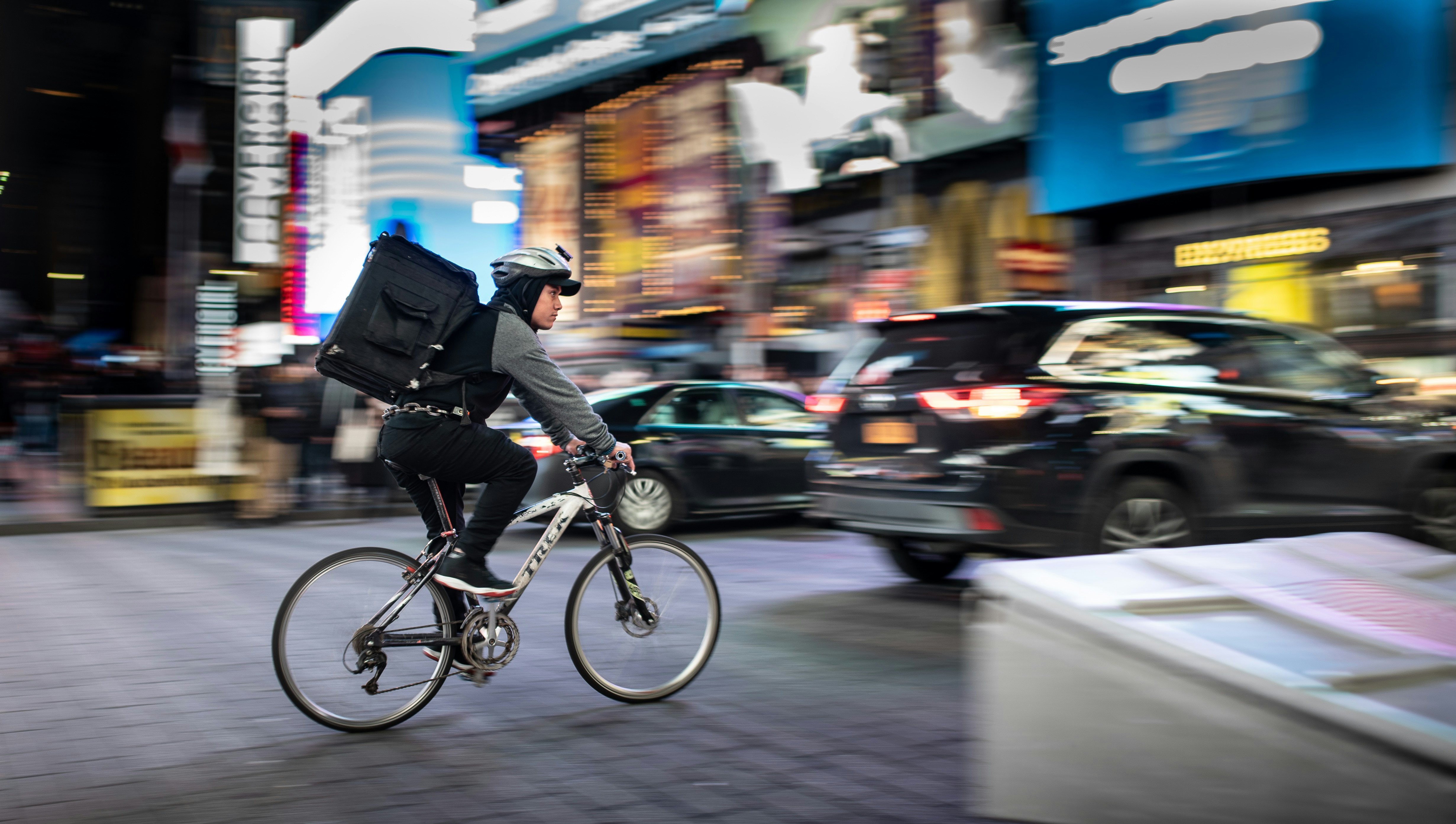
Moving goods across West African cities runs on informal networks, a patchwork of phone calls, trust, and guesswork.
Senders have no reliable way to find a vetted rider, agree a fair price, or know where their package actually is. Riders, on the other end, work without a steady, organized stream of jobs.
Dyspatch set out to formalize both sides of that exchange inside a single connected system. The core design motive was to synergize the sender and the rider through their tailored apps. In order words, they had to behave as one.
Every action a sender takes creates a consequence for a rider, and every rider update has to surface cleanly back to the sender.
For instance, Senders had no way to confirm a package was actually picked up, delivered, or if the rider is the right 'delivery-man'. I solved these through my design in the apps.

Dyspatch moves things between people who don't yet know each other, so the identity had to feel like motion and trust.
The palette is led by a vivid green (#34A853) the color of go, carrying the forward momentum of a logistics product. A deep teal (#2F6F73) grounds it, lending the steadiness two strangers need to hand off something valuable, while a near-black canvas (#0E120F) makes status and motion read instantly, balanced by clean white (#FFFFFF) where clarity matters most.
For typography, Montserrat brings an even, geometric structure that stays legible at a glance for a rider reading a job on the move or a sender checking a delivery in a hurry.
The whole system sits on a 4pt grid, keeping spacing and hierarchy consistent so two separate apps feel like one coherent product.


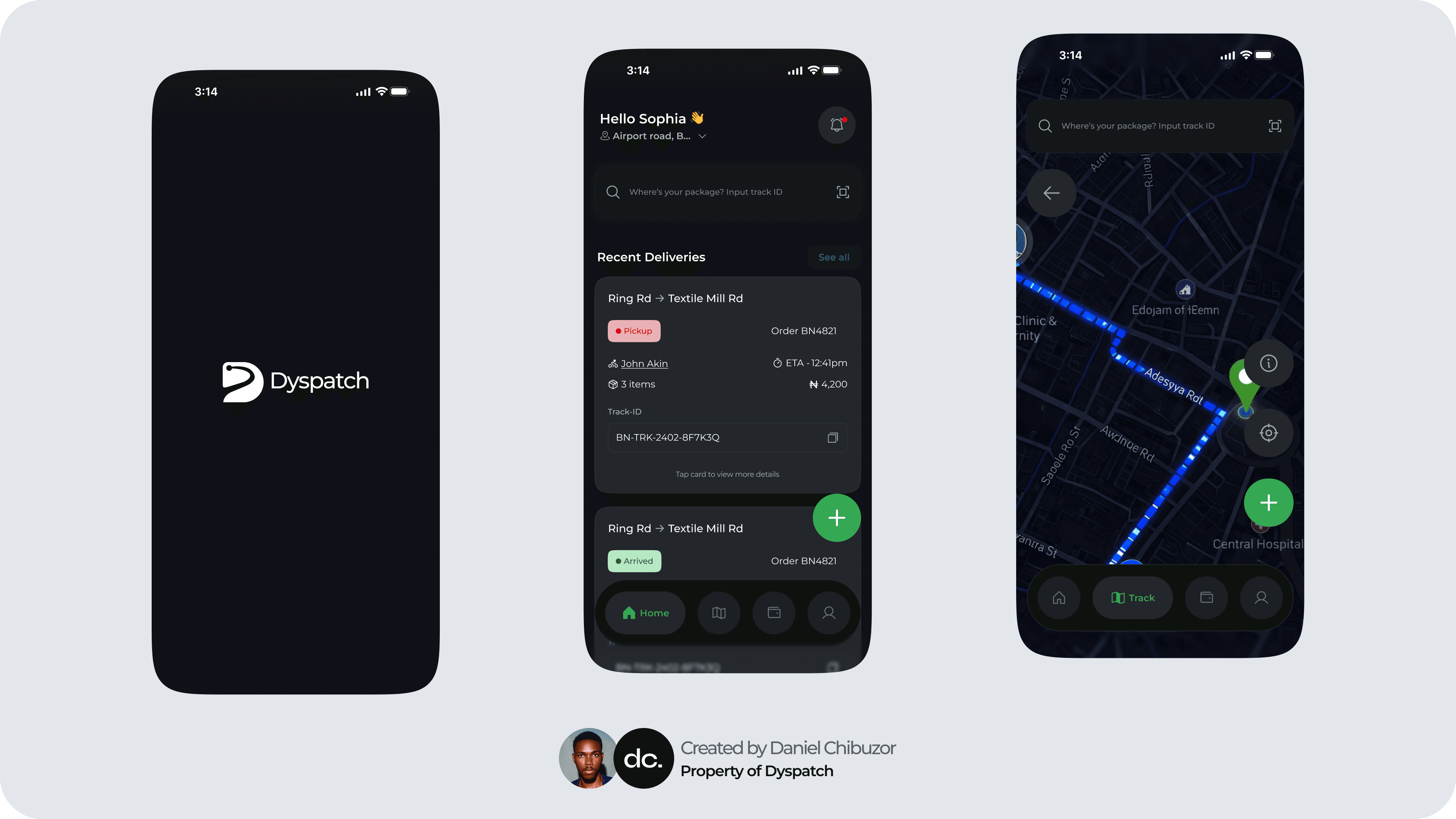

Dyspatch is really two apps wired together, one for the person sending a package, one for the rider carrying it. The challenge was never building two products. It was making them feel like one, so that every action on one side lands cleanly on the other.
Real-Time Tracking
Rider Verification
Proof of Delivery
Transparent Pricing

For the sender, the flow is built to remove guesswork. You set a pickup and drop-off, see a fair price up front, and get matched to a rider who's been vetted not a stranger you're hoping to trust. From the moment your package leaves your hands, you can watch it move in real time, and you know exactly who's carrying it before they arrive

The rider app is the mirror of that. Instead of waiting on scattered phone calls, riders get a steady, organized stream of jobs they can accept on their own terms. Each job carries everything they need — where to go, what they're moving, what they'll earn — so the work stays clear even at speed.
The hard part lived in the space between the two apps. Every sender action had to reach the rider without friction, and every rider update had to surface back instantly. A pickup isn't real until both ends confirm it; a delivery closes with proof, not a guess. That two-way confirmation is what turns an informal handoff between strangers into something either side can rely on.
