11 Sections

Industry
Artificial Intelligence
Service
Framer development, UI Design, UX Design, Prototyping, Design Systems, Accessibility
Tools


Synapse hosts events at the front edge of tech and AI — a subject that reads as either visionary or gimmicky depending entirely on how it's presented.
So the real challenge was tone. The page had to feel serious enough that industry people would trust it with their time, and alive enough to match the futuristic, high-energy world these events live in. Too corporate and it's forgettable; too flashy and it loses credibility.
The brief was also practical: design it in Figma, then build it live in Framer — so the motion and interaction weren't just mocked up, they actually worked in the real page.
Rather than design an abstract template, I anchored the whole landing page around a single upcoming event — The Future of AI. That gave every one of its sections a concrete job: get the right people to show up.

Synapse is about the future of technology, so the identity had to carry weight and edge at the same time — credible enough for serious attendees, futuristic enough to feel like the events themselves.
The palette runs on contrast. A neon lime (#C6FF3B) — electric, forward, unmistakably "tech" — is set against a rich black (#101010) and warm black (#1C1A1A) canvas that makes it glow. Pure white (#FFFFFF) and platinum grey (#DEDEE0) carry the body copy and keep everything legible and composed, so the energy never tips into noise.
For typography, Syne — a geometric display typeface with just enough character to feel current and a little futuristic, without giving up the authority a serious industry event needs.
A consistent grid and spacing system keeps all eleven sections in lockstep, so the page feels charged but never chaotic.


The landing page is built to do one thing well: turn a visitor's curiosity into a confirmed seat.
Designed in Figma
Built in Framer
Live Motion
Single-Event Focus

Seriousness and energy are balanced structurally, not with decoration. A disciplined layout and clear hierarchy carry the credibility — the page is always easy to read — while the neon-on-black treatment, depth, and motion carry the charge. It reads as a serious event with a pulse, not a tech demo trying to impress.
Built around one upcoming event, the page moves the visitor through a deliberate sequence: what the event is, who's speaking, the agenda, ticket tiers, and why it's worth attending — each section nudging toward a single, unmissable call to register.

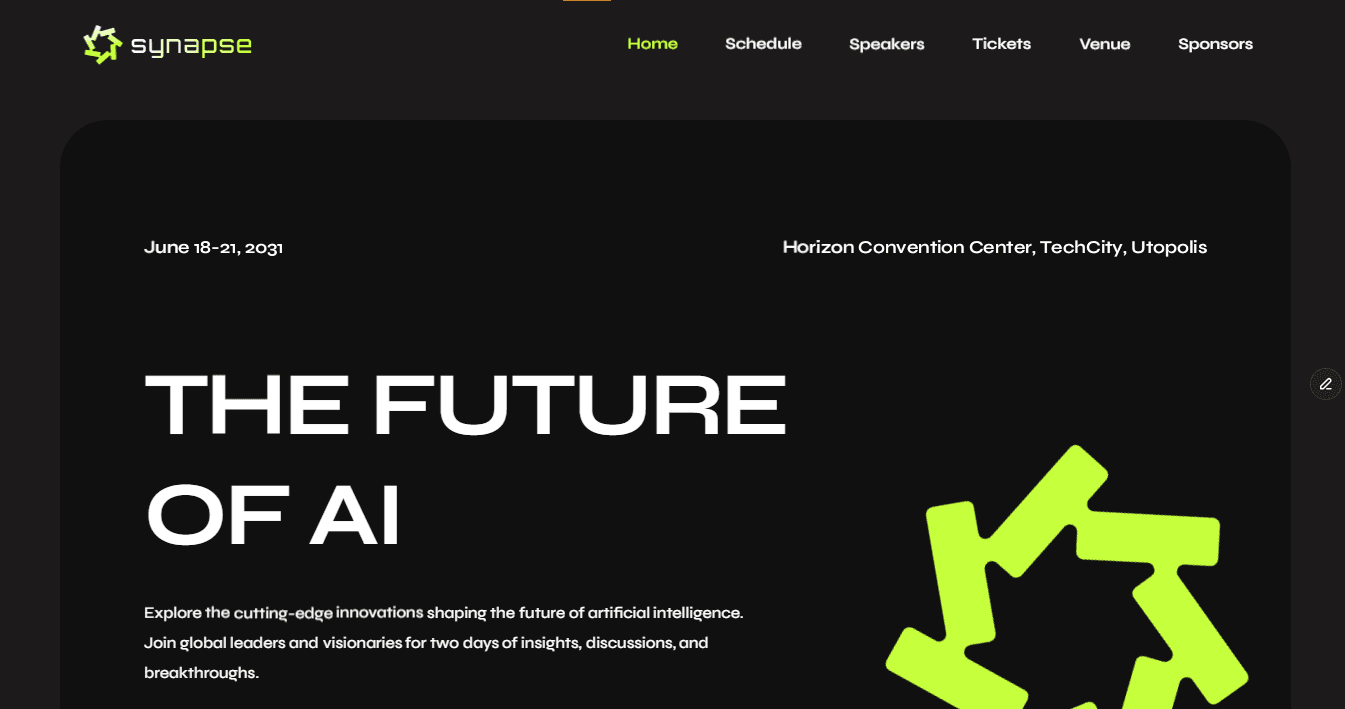
Designed in Figma and built live in Framer, the interactions aren't prototype illusions; they run in the real page. Scroll-triggered motion and transitions were tuned to feel smooth and intentional, so the futuristic feel never costs the page its speed or clarity.
