
Industry
Fashion
Service
Framer development, UI Design, UX Design, Prototyping, Design Systems, Accessibility
Tools

Kovva is one store serving three very different shoppers men, women, and kids — each with their own way of browsing and buying.
The challenge was building a single storefront that could speak to all three without feeling generic to any of them, and without fracturing into three disconnected experiences. One brand, one checkout, three audiences that rarely shop the same way.
It was designed and built entirely in Framer, which meant the polish and the working store came from the same place the visual design and the live, shoppable page were never separate steps.

Kovva dresses everyone, so the identity had to feel clean and versatile — confident enough to read as fashion, neutral enough to flatter menswear, womenswear, and kids without leaning into any one of them.
The palette leads with an electric purple (#A041E8) — bold, modern, and deliberately gender-neutral so it works across every section — anchored by pure black (#000000) and white (#FFFFFF) that let the product photography stay the hero. A touch of gold (#FFD22E) adds a premium accent, and a neutral grey (#8A8A8A) handles the quiet supporting work.
For typography, Google Sans keeps the storefront crisp, modern, and highly readable across everything from a hero headline to a price tag.
A consistent grid holds all seven pages together as one considered store.

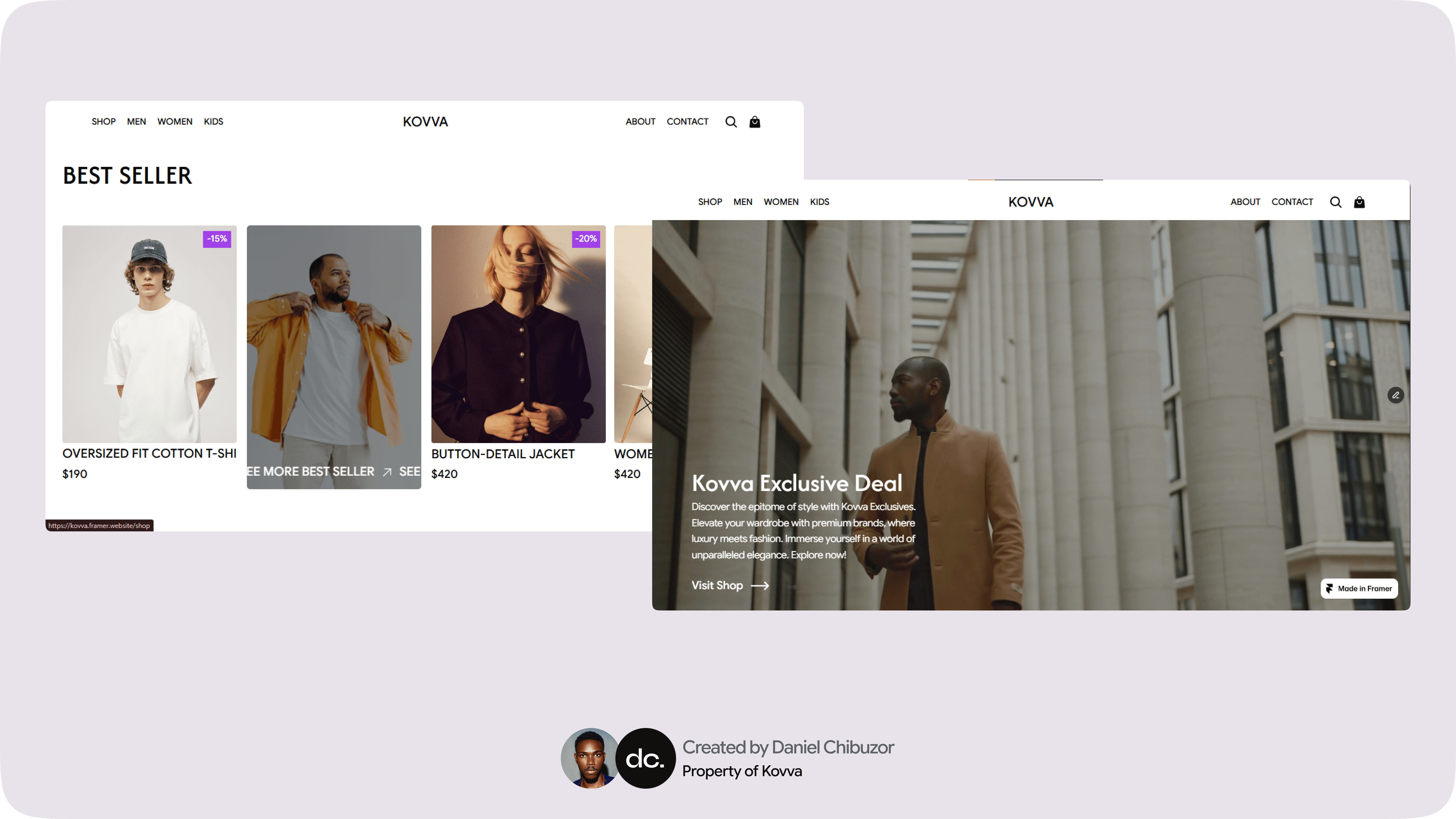


The store is built to make finding the right thing — for whoever you're shopping for — feel effortless.
Built in Framer
Men / Women / Kids
Clean Product Pages
Fully Responsive
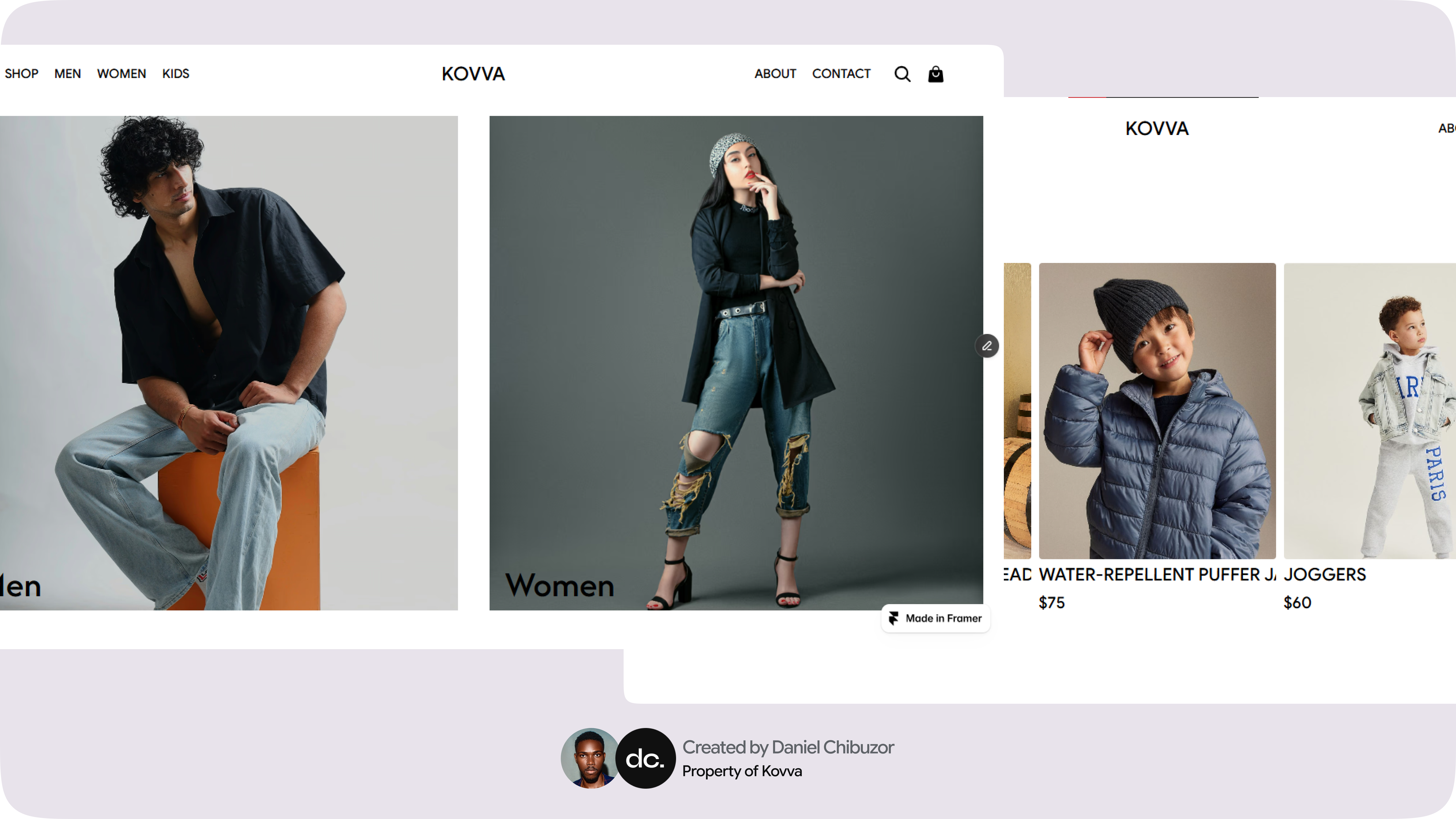
A clear category structure lets each shopper drop straight into their own section, while a consistent layout and the purple-and-black brand keep it feeling like one store rather than three stitched together.
Product pages are image-led and uncluttered, putting the clothes first and keeping the path from browsing to cart short and obvious.
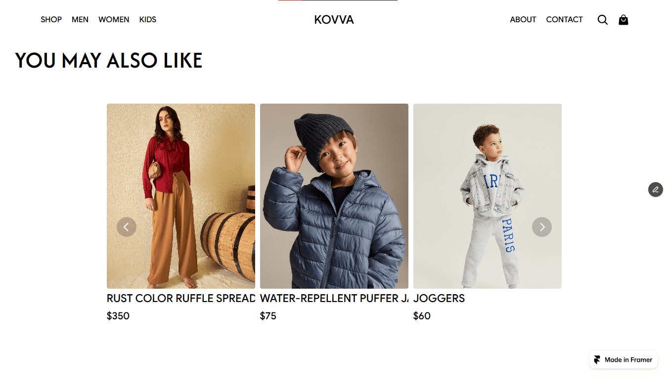

Designed and built entirely in Framer, the storefront is responsive by default the same care shows up whether someone's shopping on a laptop or a phone.
