
Industry
FoodTech
Service
UI Design, UX Design, Prototyping, Design Systems, Accessibility
Tools

Munchory connects food vendors with customers — but the vendor is the one running the business, and not every vendor is comfortable with software.
Some manage everything from a phone; some have never opened a dashboard in their life. The brief was blunt: build a management interface simple enough that the least tech-savvy vendor could run their entire operation without help, while still giving the confident ones everything they need.
That one requirement shaped every decision. A vendor signing in for the first time has to understand what they're looking at and what to do next — no manual, no onboarding call. Orders, menu, payments, and performance all had to sit one clear step away, described in the words a vendor actually uses, not the language of the system underneath.
The hard part wasn't adding features — it was holding them back.
Keeping the surface calm enough for a first-timer, while everything stayed within reach, is where most of the work went. And for anyone who still got stuck, the dashboard carries a built-in AI assistant, so instead of hunting through settings or waiting on support, a vendor can just ask, in plain words, and keep moving.

Munchory is a tool for people running a business, so the identity had to feel approachable and trustworthy before anything clever — friendly enough to lower the barrier for a nervous first-time user, clean enough to stay out of the way through a long day. Even the logo, soft and rounded to the point of playful, is a deliberate signal: this is a tool that won't intimidate you.
The palette is led by a warm yellow (#FEC325) — appetizing and optimistic, the kind of color that lowers the stakes for someone logging in for the first time — with a punch of red (#CF0304) for energy and appetite. A dark green (#006C4A) brings balance and trust, orange (#EF6922) adds warmth to key actions, and a soft retro black (#1F1F1F) keeps text easy on the eyes through a full shift.
For typography, Epilogue — a clean, friendly geometric sans that stays perfectly legible at the small sizes a vendor scans between orders, approachable without ever looking unprofessional.
A consistent grid and spacing scale holds 100+ screens together as one calm, coherent product.

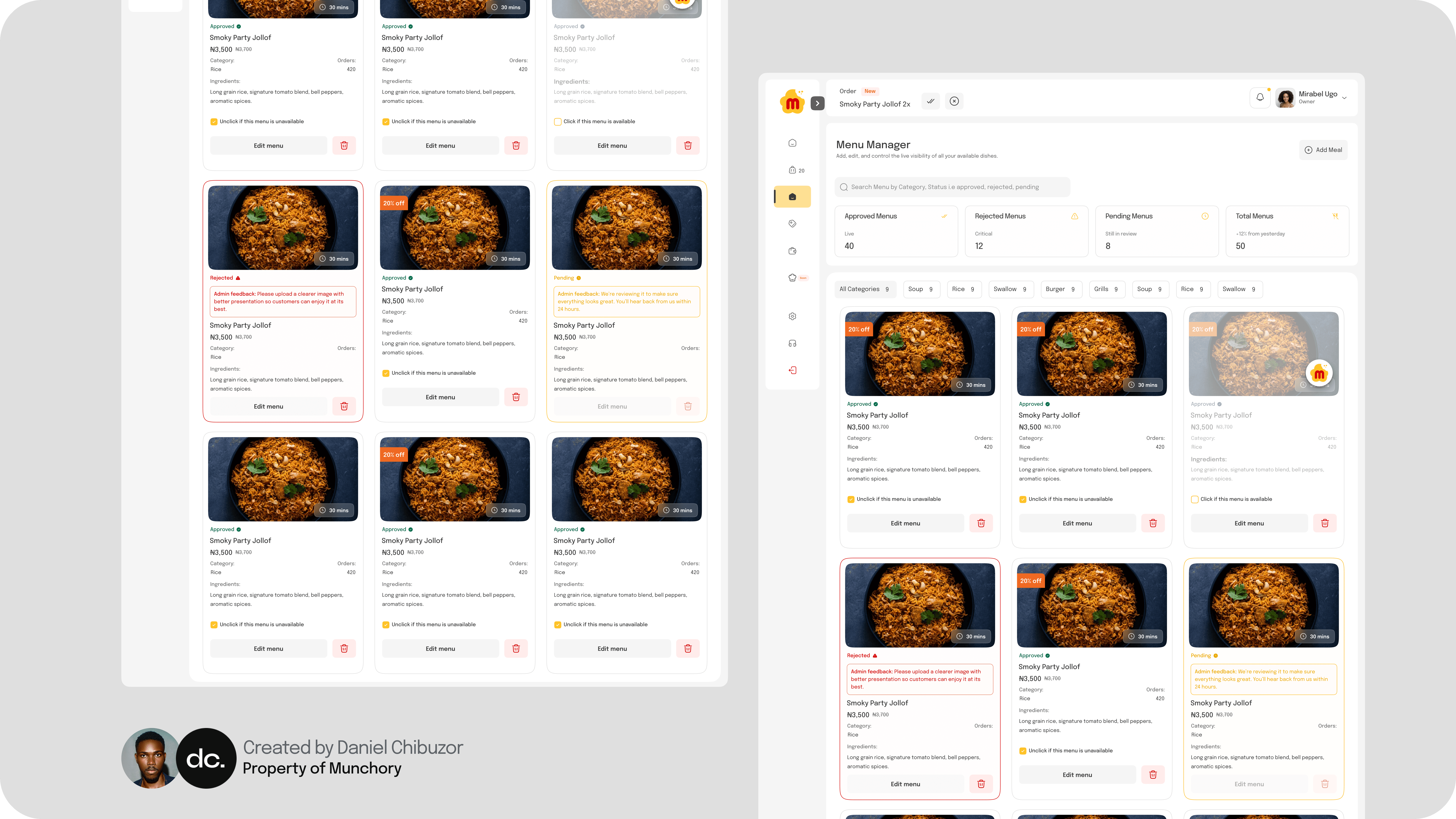


The dashboard is built around one idea: a vendor should always know what needs their attention, and never have to learn the tool to use it.
Order Management
Menu Control
Sales Insights
Built-In AI Assistant

Every screen leads with the decision the vendor needs to make. The dashboard greets them by name and opens on what matters that day — new orders, today's earnings, what's selling — with the next action always in view. Menus, pricing, and availability are edited inline in a few taps, without leaving the page they're on.
Recent orders, top-selling meals, and customer reviews sit in plain, scannable tables rather than dense charts — so a busy kitchen owner gets the signal at a glance and gets back to cooking


The built-in AI assistant is the quiet safety net under all of it. A vendor unsure how to add an item, change their hours, or read a payout can simply ask and get a direct answer in the moment — turning what would normally be a support ticket into a single sentence. It's what lets the dashboard stay this simple on the surface without ever leaving anyone stranded.
